Tuesday 12 March 2013

If you were a...?


If you were a...?


If you were a book what would your subject be and who would read it?
If i were a book, I would be a children's book with lots of mixed media textures as illustration. And children would read me.

Children's book illustration by Sara Fanelli


If you were a package what would you contain and who would open you?
If I were a package I would contain, a luxury champagne for special occasions only. I would be opened by girls who pick the bottle due to the packaging as you can tell luxury from the outside.

Stunning honey packaging and branding (via BEEloved honey on Behance)


If you were a shop what would you sell and who would buy it?
If I were a shop, it would sell clothes that was expensive so therefore a high market audience.


If you were a poster what would you promote & to whom?
If I were a poster, I would be promoting a shopping event. For example the opening of Trinity Leeds. It would be to shopping fanatics and to people who appreciate design as it is suppose to attract the most attention as its going to be highly grouped with highly profiting stores.


64933031212 GiBirWWy l 25 Beautiful and modern poster designs for your inspiration129883804397 hMjLwnQn l 1 520x512 25 Beautiful and modern poster designs for your inspiration


If you were a brand what would your values be and why would they be important?
If I were a brand my values would want to make things reproducible, so therefore I would sell things that you could wear more than once because you can change the way it looks very simply.


If you were an exhibition what would you show and where would you show it?
If I were an exhibition it would show paper craft and paper installations, it would be displayed in a high end London gallery.


If you were a leaflet what information would you contain & who would read it?
If I were a leaflet I would contain information which would be shown through information graphics as then, the people are more likely to read using the visuals. It would be read by people who like to use pictures rather than reading long paragraphs.


If you were a sign what would you show, to whom & where?
If I were a sign I would be a restaurant sign, which would be a mexican high end restaurant in the town centre.


If you were an app what would you do and who would use you?
If I were an app I would be a social networking site, but just for designers. So you can chat about the things that matter to yourselves everyone would have something in interest and you could receive inspiration from other designers with ease.


If you were a blog what would you be about & who would follow you?
If I were a blog, I would be an inspiration blog with different industries to help students decided what they wanted to do and what they are most interested in.


If you were an event what would it be and who would promote it?
If I were an event it would be a dancing event & it would be promoted by the West End. As then I would receive the right audience and would appreciate what is on offer at the event.

Communication Is A Virus


Communication is A Virus


We really have struggles with coming up with an idea for this as we all don't really like the subject that we have been given of 10000 steps. So we spent the whole week deciding on what we wanted to do etc...

We then final decided on making a band that works simular to a pedometre with lots more features on it and working more for a English audience as there is something simular on the market but it is very American audience driven.


First Critique - So we told them that we wanted to create a band which has advanced features such as how big steps and others... and promote. Which would be an advancement on the Nike+ band but is more focused on English audience and not an American audience. It will also connects straight to facebook & twitter etc...


Although they told us that we couldn't do that as we couldn't make the band and we need to make the actual product if you are going to promote it as a new band. They told us to stick to the audience of students of this college as it would be easier to see if it is working etc... And maybe concentrate on the lift and how many steps they would churn if using the steps throughout the day. Or maybe even been more specific and telling them to go to tesco for lunch etc rather than the cafeteria...

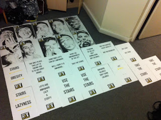
So then we had to go back to the design board where we all decided on an idea of shockvertising & maybe going down the corridor of using fat people to force people to walk due to not wanting to look like that or also maybe using swearing to make it stick in there head. 

Although we will have to be very careful about what we do as we do not want to cause offence and therefore need to make sure we thoroughly think this through.


Power Chat

We then had a power chat with Amber and told her that we had to change the idea etc... and told her that we have decided on using fat people and swearing and she told us to be very careful although I think this is very good advice and we need to concentrate on this to make sure we don't cross the line of the offensive from shock.
She said maybe to go more towards the idea of how much steps you have to do to burn off foods, as that is also shocking news as we told her my research of 25 steps to burn off one calorie etc... 

This is our written up brief that we had to hand into Amber in the power chat. We had to write our deliverable and our own brief, which therefore is more directed for ourselves rather than vague brief that all of us may have different ideas of it.


Our new plan of action
After a long hard decision we have decided on a plan of action of what to do. We have decided what we want for each phrase and how we want it to be viral etc... So at first we want people to just have a vague idea and then we will give out leaflets to back up the posters and transfer more information for them and shock them into doing more steps hopefully.


We have now decided on a colour scheme and what font we are going to use which is a main point when working in a group so our designs will flow and all join together. We thought of a few quick slogans that are posing questions as then it will make them think until the next phrase comes out?
We have gone for a black, white with mustard colour scheme to highlight the fat in unhealthy foods etc...


Critique with other groups & Simon:

They thought the photos of the fat people was too much and very disrespectful, also they didn't know if the swearing worked. They really liked to posters with just the type on and the idea of the flyer although they questioned how they would put it back together but we mentioned that this is the point of the poster to be opened and not to be put away. Finally they thought we needed to make it more viral as the website wont possibly fulfill the need of the viral advertising.


We have now decided on having a twitter & facebook linked to our website too so we can create the campaign fully viral. Although we didn't want to do this at first we decided that we was running out of time and wasting on thinking of a complicated idea when a facebook & twitter page will be sufficient enough.

We have now decided to stick with the poster idea but just not use the very shocking images and if going to use swearing use * & maybe not using it to a large point size, so from far away you can't see it. So you would have to be interested in the poster to read it up close.


All The Groups Work That We Used:


Website, Facebook, Twitter


These was all done by Alex.


Photoshoot & Posters:


 The photoshoot was all done collaboratively by the boys in the group and then Will made the posters from this. 


Logo:
The logo was created by Jasper. This was the best one out of everyones designs. And everyone decided on this one. As the brackets make the A and then also links in within the website name thehiddenc.


Motivational Stairs Stickers:

These were stickers that Will has created to put on the stairs. This I think works very well as we couldn't stick them directly onto the stairs we put them on with blue tac. Although I think if we had to choice we would have made them with sticker paper and look more professional.


HotDog Book:


This was created by will which I think was very good for the information was very striking and very fitting for the audience.


Flyer Inserts:


I did these, These are to insert into the poster. By these I wanted to interlink the unhealthy photoshoot with the subject of 10000 steps.


Flyer:

The poster was created by Laura. She also worked out the dimensions and the folds for this innovative flyer to be possible. I haven't got a picture of her poster although it was just simple with facts on about walking you can see slightly the style on the lower bottom right corner.


Dan did create posters that wasn't used although I think they was very clever and innovative. By using shocking factors such as this elevator could break down at anytime etc... I haven't got images for these either but I thought we should have used them around the college too.


Evaluation:
I think overall, I worked hard in my group I put alot of effort into the flyer inserts and developed them largely to the finished design, as this was my only role I thought about doing other ideas too which are shown on my design practice blog. I helped largely with the idea generation as this was a big part of our brief because it changed so much throughout the three weeks. And I was there mainly all of the time for group meeting just one half day where I wasn't able to meet.  
I think I worked well within the group I gave feedback to peoples work and also asked for feedback on mine as it matters what they think too. Although, I do feel like I shouldn't have given more vocal input. 
The positives of working in a group is having others peoples thought and then you bounce of theres and the volume of ideas and possibilities becomes extremely large. Also, the challenge of doing something you don't particularly like doing for three weeks although I think we all got on well and I contributed well also.
The negatives of working in a group are not knowing what other people think and how they work. As you will all have different aesthetics and trying to please them is very difficult. Getting some members to come in as a group was pretty difficult and you end up not knowing what they are doing and its hard to match there designs with yours was difficult.
I think next time I would voice my opinions a lot more and try get everyone to come to a final and substantial idea process by the end of the first week, as this was our main problem to overcome.  Also, more research early on in the week to the main focuses of the brief such as viral advertising as this is an important factor and we went with a boring old networking. 
I think we could have improved our resolution by directing the group from the second critique fully away from the images of big women and also swearing and then we could have concentrated more fully on having a  more sophisicated shock factor to our campaign.
The strengths of our presentation were that there was many slides to talk about from and we all had good knowledge of each aspect of the project. Even though we didn't have a set time for each other to speak we said we would talk about our own things and if something wasn't said we would say it for them etc... The audience was very humoured from the group talking about the posters etc... So I believe it got a good reaction and people enjoyed. 

Monday 4 March 2013

Personality & Practice Session


Personality & Practice Session


What makes you, you?
What makes you a designer?


We had to split into our communication as a virus groups, and then get into twos although there was one missing from our group so it had to be a three & a two. I went into a two group with Laura and we had to write a statement for the other three from only there pictures they have chosen for there personal & professional practice.

Our first one we wrote about is...

Daniel Everitt

Personality
Open Minded
Easy Going
Appreciative of Others  
Johnny Cash
Travelling

Practice  
Layout
Colour
Negative Space
Geometric
Screen Print


Statement    
Daniel, more commonly known as Dan. He has a very easy going personality & is very open minded to others opinions & thoughts. He likes to work with colours & layout as these are important in creating a successful aesthetic look. He uses negative space to his advantage. 
 
Feeback
He said that me & Laura was pretty much correct but they only thing we didn't pick up on was that it wasn't negative space but printing methods but he also likes working with negative space.


Will Jefferey

Personality
Music
Laid Back
Shy
Futuristic
Organised 

Practice 
Produdt & Packaging
Branding & Identity
Illustration
Image & Type
Type   


Statement
William, more commonly know as Will. He receives inspiration through music. His personality is very laid back but also has a shy nature. His interests lie within branding & identity and product & packaging, with a very illustrative style. He is very interested in the relationship between image & type.

Feedback
The interests of his are not quite correct although ht likes working with them the ain't his main ones. They was meaning more collections of things so working with one design across different medias etc...


Jasper Lee  

Personal
Football
Coffee
Clothes
Learns from mistakes
Organised Study

Practice     
Type
Innovative Ideas
Image as Type
Dual Meaning
Logo Design


Statement  
Jasper, more commonly known as 'Big J'. Has a love for football & fashion. His main focus is to learn from his mistakes and develop upon them. He has a big love for type & image as type. And interested in logo design & likes to come up with innovative ideas.

Feedback
He said that we got it pretty much correct. As we got all the key points etc... especially with the logo design and how he has a main love for football & fashion.


What they thought about my images?   

Personal  
Clumsy/Accident Prone
Seaside
Family
Likes Dance
Smile

Practice    
Popular Design
Hand Crafted
Digital
Varied
Shapes
Geometric


Statement     
We believe Melissa to be accident prone & very close to her family. Is active & participates in dace. She is very smiley & friendly, she enjoys the seaside also.
Her practice is very versatile & varied as she is into hand rendered & digital work. She likes colour, her focus is away from type and more towards image.  

Feedback
My personality is very alike me although they may not have what i was portraying in my car picture I think it is still very relevant to me. I believe that my practice is versatile although i do like working with type also which I don't think they didn't get due to no type shown.