Wednesday 20 May 2015

Evaluation

Overall I feel this year has been the strongest year for my PPP. I think its because I could define who I was as a designer without pigeon holing myself. I have willingly gone to events & visits where as first & second year I wouldn't have wanted to go due to nerves but I have realised this year you just have to do what you have to do.
I didn't see it as a chore and I found it interesting and therefore reflecting on my practice and finding myself analysing everything and comparing & relating it again my work.

I wouldn't say I totally combatted my nerves about contacting professionals but I would definitely say I have come on leaps & bounds. I wouldn't dream of ringing up a studio as I believe that I would say the wrong thing and first impressions always count! I now feel more confident in my portfolio and will be proud when it is laid out at the end of year show. 

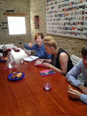
I have managed to complete one placement at Big Fish in which I learnt a lot from after a lot of deliberation with myself about how bad the week went initially. I have also managed to arrange another at Thompson Brand Partners which I extremely looking forward to after my visit last week! I feel I willa chieve more knowledge about the way the industry works here as Ian seems very friendly & helpful. He seems like he genuinely wants to help.

Although, I was disappointed from my placement at Big Fish. Now visiting Thompson that not all studios will be like that. I realised that I wouldn't want to move to London or anywhere far away just as of yet maybe for my first and second job because while I was over there I felt very lonely & made experience worse due to having a lot of time to reflect over the night, therefore I have focussed my research into jobs in travelling distance from myself, but not stop myself for aspiring to big & better studios later on in my career, its good to always have aspirations! I never want to get bogged down in one place.

Friday 15 May 2015

Thompson Placement Arranging

Today Ian has been in contact with me & Adam to tell us that they would like us both to go for the 2 week placement at the same time. And that we could chose a time that was best for us. 

I said to Adam that he could chose the time as he lives out of Leeds. So he said the weeks starting the 15th & the 22nd would be best for him... So I said that I would check with my work as it would depend if I could get the time of with such short notice.

I have contacted my manager and my current work place are getting a shop refit on those two weeks Adam has picked. So my manager said she can't authorise anything now within those two weeks. 

I then told Adam my issue and asked if he could do the week starting the week 6th of July. He hasn't replied as of yet... But I shouldn't think it will be a problem as he is moving out of his house on the 10th of June anyway so would have to find somewhere to stay no matter what date. 

If this is not ok with Adam I am going to suggest just going separately as I can't drop my work place as then I would have no job to fall back on.

Thursday 14 May 2015

Final Portfolio

This is my final portfolio that I have created. I am happy with it but this will be changing as I not want to input my whistles & log cabin within because I don't have good enough pictures of them both as of yet so these will be included.

Wednesday 13 May 2015

Website Development

I have been very afraid of building my own website up to now.... I have started looking at domain names and now I have purchased my very own for two years... 

www.melissagater.com

I am now starting to build my website on Wix although I haven't got to a minimum stage of being able to publish it yet it is something that I am very looking forward to doing. 

I have at the moment made a simple mock-up of how I would like the website to look like...


These are just two pages of the four that I have developed.

I have choosen my template on the Wix website so now i just need to build it and then add my domain name to it. It is going to cost around £130 which I think is quite good to say how professional & easy it will look.

Business Cards


These are my business cards I have created. This is just a quick mock-up of what I want to do... I would like to duplex the card so its mint on the back with white screen printed detail and then the white card on the front with a diecut of the M so you can see the mint card through with the diamond in copper foil.

I chose to apply the information in more of a friendly way as I was sick of the boring old application I tried thinking of something new to apply to it.

Then I thought what is it that everyone knows. I thought about verbs telling people to do things will be more motivation people might feel like they should visit as I am telling them too. I am glad I chose this and its definitely a feature I am going to keep as I feel its more personal that the typical icons used.

CV & Mini Portfolio


This is my CV I have decided to do create it so it can fold up into a 10x 10 cm square as I wanted the interaction & they didn't get all the information at once.

I have decided to apply a mini portfolio on the back as this will lower postage costs and also give them a little insight into my work so they have a little background about me and my design work.

Originally I made this for my last branding and I have just applied my new logo and changed the colour scheme from purple to mint.


I have also created an envelope for this to be sent out in....


Thompson Inviting us to Present

A couple of weeks ago we received an email from Amber telling us that Ian from Thompson has been in touch with her to ask if we had time to go over to their studio to present our DBA presentation to his design team.

I thought this was a great opportunity, due me being able to see the environment I would be working within before setting up a placement.

From winning the DBA pitch we had the choice of picking one of the four studios to complete a two week placement at. Therefore Something More & Thompson where ones that I would have liked the opportunity to complete experience there.

So today we went to the Thompson studio in Roundhay, with Caitlin, Grace, Charlie & Adam. We got there and Ian greeted us straight away I loved this it seemed a very small and personal friendly studio. He then gave us a tour of the studio. It was a converted stables and therefore had exposed walls and beams. I loved this about it.

There was about 12 people that worked there so it was very cosy, but he did mention that they was looking to get somewhere bigger to expand. But they didn't want to lose the character or cosiness so its going to be hard to find somewhere just as nice.

He then took us to the boardroom where he told us to help ourselves to drinks and biscuits. Adam uploaded our presentation onto the big screen & we just relaxed a bit before starting the presentation.

During this time we had time to read through our notes from the presentation to refresh our memories as our actual presentation was over two months since we initially presented.


We then presented the pitch to Ian & four other designers, we used the same running order that we used in march as a lot of it we could remember and therefore just refreshing our memories.

Ian was very complementary about how close we worked together. He said he knew how hard it was working within a team and being able to generally get along well. And not being afraid of telling some or others saying that this one is stronger than yours. He told us that the way we have worked within the team tells him that we have the skill, as he said egos can tend to get in the way of working well together. 

He was interested in our design process and how we had got to the final resolution, which was a repeat from our last feedback, back in March. We explained that we all worked together to get logo ideas and then we picked one and refined it individually.

Something that one of his designers mentioned that we did not consider was the chevron not actually pointing north and are actually point north east. They said this something that the client would pick up on, and expect it to be changed to pointing north, not realising the amount of time that would take to make this happen. They asked if it would still make sense without the chevron within the C and the N but I explained that this would still flow but you may not realise the break within there and therefore the C & N would not be visible, as it would lose it clarity. I realised how much you look at something you may not able to see something until someone points it out to you.

They also suggested that we should change the posters because the grey shape behind the chevrons are not applying anything to the posters. And the white coloured chevrons seems to be our of place compared to the rest of the brand. Ian then suggested to reverse the chevrons and use the pattern in the colour as the background for more texture & depth & have the chevrons in white.

He told us that our brief really stood out compared to the rest and that we should definitely include it into our portfolios. But told us to think how to represent it effectively within a printed version.

He then asked for all our emails and told me he would get in contact with me about a placement, overall I found the visit very helpful and left me having faith within studios again after my bad experience at previous studios. I think the feedback was more professional & personal compared to the feedback we received in March.

I emailed Ian the next day:

Hi Ian, I just wanted to say a little thank you for inviting us to your studio yesterday afternoon. Myself & the rest of the group really enjoyed being able to present our work as well as discuss the project with you and the rest of your team. Previous to this I was a little undecided about were to go on a placement, but after our visit yesterday it has cemented in my mind that I would love the opportunity to be able to do a placement at your studio. It seemed very friendly, with such a lovely setting, unlike my latest visit I had at different studio. It gave me the back the glimmer of hope I needed about my future career.

Hope to hear from you soon,

Melissa Gater.


He then replied:

Hi Melissa,
I’ll be in touch soon about work placement. Good to see you all again the other day. The team were very impressed by your work.

Ian Thompson


Thursday 16 April 2015

Job Application

Today I seen a post on Instagram from a the studio nu agency in Sheffield, advertising that they was looking for a creative junior designer. So therefore, I thought I would apply as they wasn't asking for anything other than a CV & Portfolio. 

I had to quickly change my CV as it still had my old logo on but I just kept my old colour scheme as this would have been a long time consuming thing to change.

This is my email I sent with my application.


I am not expecting anything to come from it but I didn't lose anything from doing it. Experience can only be gained by taking leaps of faith. 


Friday 10 April 2015

Big Fish Placement

The walk this morning took me around 20minutes, although it was an enjoyable walk as there was lots of things to soak in...
When I got there, another also was walking into the grounds. She looked a little lost and therefore I asked her where she was looking for she also said Big Fish. So I told her I was too and where we needed to go. She was called Catalin and she was from Germany.

We then walked into the studio and went to the receptionist to find out where we needed to go etc... We asked for Emma, they seemed rather shocked that there was two of us here so I started to panic a little. They told us to take a sit next to there range of work they had done...


We sat there for a while admiring their work. Then Emma came over & took us for a tour of the studio. The studio was on four levels. On the entrance level was the designers and the photographers. They also had a cute little library and a small meeting room. Then the next level down was the web designers and social media people. Then the level below them was the artworkers & the copywriters. Then the level below them was the large meeting room.


This is their mini library, which was also stacked very tall.

Then Emma let us present our portfolios, I found myself not as nervous as other presentation as I felt more prepared and I could just follow the paragraph on the previous page but just in more detail to make sure I got everything in. So this is something that has definitely benefited me I noticed. The only feedback she gave me was that she would have took out the bottom box on my campaign posters for whistles as they looked like an afterthought. Although she mentioned it was due to the lack of capital letters so I told her this is something that was mention in the Whistles brand guidelines as they don't like the use of upper case letters.

Catalin then presented her portfolio, it was good to see where she was at due to her being currently doing a BA masters in illustration. She has done a little story through illustration about her finding big fish and how it has effected her design, which I thought was very clever. Her portfolio was very different to mine due to focussing only on one style of illustration in which I don't know if this is a good thing or not with it being a different course.

So then I was sat at the placement mac which was attached to the scanner as this would be one of my jobs while on placement. I was then told about the scanner and what they would expect me to ensure.. She then told me to occupy myself for a little while, till she finds some work for us to do.. She told us it was a bad time as this is a low week for work due to just having a long weekend off.

At dinnertime I was sent on a mission by Mark one of the designers, he gave me a map & a list of boxes of cereals they needed. He explained that the had applied for the Dieline Awards & now they have come back to them asking for samples and therefore this normally means that they have won something. But they was already late for the deadline due to forgetting about this before the weekend & they didn't have all the samples they needed in the studio. So he gave me his oyster card a business card & a map with a list of shops to try that stock the dorset cereals. The main thing he told me was to make sure that the boxes look like the original ones on the pictures he gave me as they have currently added a woodland advertisement and this is not the packaging they submitted.


 This is the original packaging without the advertisement on... These are the ones we want.


These are the woodland advertisements with the little trees placed on the front.. These are the ones we don't want.

Unfortunately I wasn't able to find all of the cereal he wanted without the advertisements on. I got two of the four they requested.

When I got back Emma briefed me on a brief that two other designers where working on. This was very interesting as I got to know how they started a brief with the client etc...

The brief was starting from complete scratch because the company that has come to them, don't have a name and want Big Fish to help them to come up with it. It is a s healthy juice & nut milk company. They will be made fresh everyday and will have nothing but healthy nutrients in them. They want them to be extremely enjoyable and healthy! These bottles will be charged at £8 per 330ml.

The current names they have are:

The Juice Spa
Grace Under Pressure
Florence
Avalon

Emma gave me a print out of a presentation they give out to everyone working on the project after the position with the client. Positioning is where they work out what the client wants, where they think they are going to be? What they think the are etc...

They print out lots of inspiration pictures of the internet and cut them up and put them into sections according to the brief.. then the client can go to each category and say yes they like that and no they don't like this can also be done with keywords.

This was very interesting as this is helping quicken the process rather than developing a range of ideas that they might not necessarily like all together.

JJJ BRIEF

Emma told me to work on The Juice Spa as a name, as this is the name they had the least work on... This is not a name I would pick as I don't think it represents the brand as a whole as they also create nut milks too.

I started with creating a logo today...


Day Two
On my second day I carried on working on the juice spa brief... Today I moved onto applying the logo onto packaging....

Here is my packaging design I did...

Here's the first design that I did, they had already taken images of the juices within different bottles so they had lots of clean mock-ups to use from scratch... This was a very good idea... And something I didn't expect the studio to have done.

I thought I would go the foraging look, I wanted it too look spa like but not too spa like that you wouldn't want to drink it....I liked the use of the opacity of the floral pattern in the background with the pure white logo overlaying it. Although, this works very well with the orange I don't think it would work very well with the almond milk.


This is my second design, I decided to use the same imagery but change the use of the type. I created a new logo as I found that the square bottle didn't really work with the circular logos I created. I like the use of the square bottles I think they feel a little more durable in your hand.


Then I heard Emma & Ruth talking about there work and they was saying how they wanted to work with something new, they wanted to be different from all the other drinks out there that are just printing white onto the bottles as this seems to be the hip thing to do.

So there I began to work with something new...


This is my innovative idea thats different & will set this product aside from all the others. I like he use of the string holding on the wrap as this would be cardboard. The ability to apply a batch number I found was a good selling point as creating fresh juices is something they pride themselves on..

Then I got sent to go shopping for a brief that Nicole was working on... I rang around shops first to make sure they had them in as these where quite high end desserts and therefore only stocked in certain stores. A lot of the stores had only one or two of the three flavours and therefore pointless. It was a photoshoot that needed to happen for a new GÜ pud packaging they was creating. I again took the oyster card and went with business card shopping. I also had a list of things such as lemons & hazelnuts & dark chocolate to get as they wanted to a little food photography such as lemon curls to include on the packaging.

Day three
On the third day I was again working on the JJ brief & therefore I decided to do some more logo variations to inspire me again.... From the pictures they said they liked the aesthetic of the blue & white morrocan pattern seemed to be prominant and therefore I thought this could be a good starting point for the design.

Mid day I was sent to go and get some food for a client meeting they was having as they ordered food but one of the people was dairy intolerant and therefore the food that had been ordered was not appropriate.

I then had to go to the shop & find something that was dairy free. I couldn't find anything that was prepared that I knew was dairy free so therefore I decided to just get some bread & salad with ham.

This is my logos that I had been working on throughout the day..


These where inspired by Moroccan titles & patterns. I like use of the overlay drawing creates a night cast of shadow. I like shape as it is unusual and not the typical circle or label that wraps around. The sticker would have a white background with the navy detail over laying. 

I then started working on something else that I noticed that they had pointed out that they liked collage style design therefore inspired me to do another logo design.


I like how the orange plant overlays and underlays the outline of the logo but the writing is all sitting on top. I think this is the strongest logo yet although I think the font needs to be a stronger maybe a serif font to highlight the name more.


Then I found a paper with the flavours within each drink, I then came to realise that these where not your average juices and therefore had veg within them so I decided to create the same kind of look but with multiple food.

At the end of the night we had to move the studio around as they where changing the layout of the office. They was changing it so the copywriters where moving into the same studio as the designers and then the art workers would be able to expand. 


Day Four
Today I was sat in a different place as my seat where I sat had moved due to the copywriters needing the space. So I sat next to Catalin on my mac. I didn't like my seat today as much as I coudln't see everyone and take in what was happening behind me.. Where I was placed before although everyone was not sociable or welcoming I could see around me and still take in what was happening.

Then Ruth came up to me and told me that she had been looking on the placement mac that I had been working on all week and that she had been working on something similar to my design and therefore she would like me to prepare the design style as a root for their client.

This was a massive boost of confidence and I felt like I was actually getting somewhere, which is typical on the last day! She told me she wanted a serif font with images of all of the ingredients overlapping and underlapping the words. 

Another key thing was that she wanted the word DEW on the front of the bottle & the word SPA on the back of the bottle. This is so when they sit in the shop it can say DEW SPA next to each other.

Here is my design I created for her...


I wasn't able to get all the files as I was unsure if I was allow to take them & didn't feel confident enough to ask them. This is the spa variations but sadly I didn't get the dew variations.


 I like the bottom variation best as some overlapping happened on each letter.


I then decided to mock it up as it was nearly finishing time and therefore found that it would be best if I had something to show Ruth all together than something broken & something half finished.


This is the mock-up I created I would have liked to carried on this brief when I got home but this is when uni started to get pretty full on as deadlines started to occur....

When I approached Ruth to tell her that I hadn't finished my task but I had done the juices bottle. She seemed very shocked that I was asking to go home, I would have stayed but I had a train to catch & therefore this made it unachievable. She asked if I had put the work onto the server so she could see what I had done. 

She seemed very impressed and said that she was happy with what I had done which was a relief as I felt very on edge when I first approached her as I thought she might have been a little more understanding with it being my last day. 


Overall, I think I have learnt a lot while on my placement but I feel that the experience wasn't as good as I felt it was going to be as they didn't have much time to spend with us and I felt I was used mainly just to do herons not just for the design team but for the receptionist too. 

I think the last day was when i felt most comfortable as after moving the studio round it was a bit of bonding and people started to know my name but this was just a little too late. They told me on many occasions throughout the week that they was going to look at what I had done but they didn't check once until the final day when Ruth asked me to do a task that I thought was worthwhile and what I was there expecting to do....

I felt that they gave me that brief to occupy me but didn't expect my ideas or opinions to matter as they didn't once ask me how it was going and what my ideas was.

Wednesday 8 April 2015

Big Fish Stay Planning

Firstly I did research whereabouts that Big Fish where based in London. It is based in Chelsea, so started looking at hotels around this area, but they where very limited and the ones that where quite near by where very expensive due to being boutique hotels. 

So therefore started looking further out, and the next district to Chelsea is Fulham which is slightly cheaper and therefore I thought this would be the best option as long as my work place would be in walking distance. 

There seemed to be quite a few hostels that was very cheap but wanted my own space and these also had quite a long walk and would not benefit me cost while with travel to & from work.

Sara Hotel
£230.00 
En suite
21mins walk.

23 Hotel
£196.00
Shared Bathroom
36 mins walk.


I then came across a travel lodge in Fulham which seemed to be a reasonable price, slightly more expensive than some but had an en-suite & a well known chain so therefore know what to expect. 

This was quite important to me as I was nervous about getting down there on my own and therefore didn't want the added worry of if I would be safe and comfortable in my room etc...


So I decided to go with the Travelodge in Fulham which is a 21 min walk.


Now moving on to trains, I have had to do some research into which station will be the best due to me going straight to my hotel on my outward journey but on return I will be going from my work place and therefore I need to find a balance. 

So there is Imperial Wharf & West Brompton

West Brompton is 3 mins from Hotel & 21 mins from Big Fish.
Imperial Wharf is 9 mins from Big Fish & 23 mins from Hotel.

So I have decided that I am going to get my train to & from West Brompton, but on the way home I am going to walk to the Imperial Wharf & get a train from there to West Brompton, but I will pay on the day for this journey.


I have to have 3 changes on train to get from this train station. This is to & from, even though the routes are different each way. This is making me very nervous due to never being to London on my own before and therefore this is a big step for me for my career.


Friday 27 March 2015

Today I presented for the last ever time while on my course! It was really nice to see everyone else's presentations and see how much we've improved as designers and people together over the last three years.

These where my notes that I read from for the presentation:

Hello for the last time in a presentation.

So coming here I thought I knew how hard it was going to be, but I really didn't.

It was ALOT harder but more rewarding than I had planned.

My first project that I remember was the type & image poster.

This is my outcome I didn't thin it was that bad until I re-looked at it. Why would I put the text in the wrrows? or use that text? Also, my image & type & image poster is practically identical.

And I thought I knew everything there was to know about design! How wrong was I?
Because I came from ND graphics, I didn't want to do all the learning again for the type anatomy & layout. But all I can say is that I am so glad that I did..

So 2nd I believe that module OUGD504 was the part of the course where I realised some big decisions.

Design for Print: I found that I love been hands on & how much a tactile finish can add to design.

Design for Web; I realised that I hated coding & it wasn't for me, although

I did like designing an app & website for my design for print & web. I think this is because I can actually design without making it happen. 
So after doing this I didn't hate doing web design, especially when I realised that you can design a website without coding it as they are two different jobs.

Design for Print & Web: This was my first brief where I believed everything came together really well & realised I love branding across a lot of collateral and packaging.

3rd Year - my favourite project so far was:

Whistles that I submitted for YCN:
This I felt very proud of not only having worked with an existing brand for the first time.
I created a scent range for both men & women & created a poster campaign to go alongside it. Although, this was very stressful I have realised that I want to go into the packaging industry.
Although I would also love to go within the installation too, which this is something I am working on to make connections.

COP3 - so this year for COP I created on the theory that physical design is more engaging than digital design.

This has really reflected on my work this year. Due to creating & making things & opening intriguing ways or the need of interaction to the the full experience out of it.

& this is something I am constantly asking myself without realising, so how they have to break something open & how I can make that a more intense exciting experience.

My Personal Branding over the years...

So first year I created a big box with chocolates & a swatch of quotes! Which when I think back now its cringeworthy & so impractical.

2nd Year; I created a CV that folded up into a wallet that I could send out. It also held a mini concertina portfolio but I just hate this logo now & I think it has something to do with the imbalance of it.

3rd Year: So this year I created this so far, its a CV that folds up innovatively. And a circular logo calling myself a hands on designer, rather than a designer & illustrator like last year.

So with this I have sent out many emails & applied for placements.

And I received a studio visit with a lovely guy at brand on shelf, who seems very interested & wants to see me in the next 2 to 3 months with an adjusted portfolio with the changes he told me.

And also I have managed to gain a weeks placement over easter at Big Fish in London. Which I am very excited about but also extremely nervous as I have never been to London on my own before.

So in my portfolio review with Andy he told me quite a few things but one was that my logo was too set & I needed something that I could work with more freely.

So heres my new branding I very pleased with it & I think it shows more of a refined approach which is good.

So my plan for when I leave is to pester pester pester to get a job that I love. I would like to get a summer internship too.

I thought that at the end of uni I would simply walk into a job & I have soon come to reality, when emailing studios trying to just get a visit is hard enough. I just want to get out of retail so I can have my weekends to explore & do more things.

SO the things I love & will carry on:
-Obviously GD
-The friends I have met - always good to have good connections ;)
-Looking @ studios. I think I will always have one to aspire to even if I am happy @ the one I am currently working at.

Things I love & will miss:
-Brownie from the smoothie company. I did become addicted at one point.
-Also miss being the big fish in the little pond, as now we are going to be tiny fishes in a massive swamp.