Wednesday 14 May 2014

End Of Module Evaluation


1.  What skills have you developed through this module and how effectively do you think you have applied them?

I believe I have become more confident when it comes to thinking about contacting studios and how to approach them. When I first started this year I avoided this question totally although now I would be happy to go to a studio & ask them questions about there practice.

I have never thought about setting up my own studio before as I thought that this would be a very hard process. Although through this module within PPP I feel that I would be confident to set up a studio in collaboration with others. This is a big step and I feel I have definitely achieve this big step since this is a new horizon that I never thought I would ever be able to achieve.

My promo pack is very informative and I would have put all the no-gos on that john has told us for example why would you grade your software skills this is a very good point that I have never thought of before. We are learning from the outside world of the industry of how people that are going to give you a job rather than from your peers etc…


2. What approaches to/methods of design production have you developed and how have they informed your design development process?

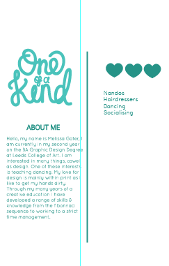
I believe that I have made the most of the creative CV I can. I haven’t included much informative information because I believe that they will get to know me personally rather than through the CV. If they like my design they will make a decision upon that and then invite me for a talk.
I wanted to create a promotion pack that would correspond to the way that I work. I think having the CV as a wallet to hold the other elements of promotion tells them that I am organised and have a purpose for all elements of my design.

I like the way I have design the CV as I can control the order that they read my CV in and then go onto the other elements such as the portfolio & business card.


3. What strengths can you identify in your work and how have/will you capitalise on these?

I believe that one of my strengths is the reflection that I have produced when designing my work. I have made sure that all elements are not just because I like them but to make sure that each element means something about my practice and me.

I worked well within the collaboration for the group business set up. I met deadlines and made sure I got my opinions across this is something I have developed as I before I just took a back seat and and let others make decisions for me.


4. What weaknesses can you identify in your work and how will you address these in the future?

One weakness I believe that within my work is my time management for my branding I have let other deadlines take priority when I should have spent more time on this as this is what is making me as a designer. I do believe that I got a lot done in the time I set and to the highest possible standard but I wish the deadlines were more spaced out, possibly with the group task before Christmas so this would have been the only PPP task to concentrate on is the second part of term.

Another weakness in my work is proofreading I need to make sure I leave time to proofread my work before printing as I have notice a few grammar mistakes and therefore this would have a big impression on to the studio that I am sending my pack out to.


5. Identify five things that you will do differently next time and what do you expect to gain from doing these?

1.     I would like to code my website rather than just proposing it, as I believe this is a big promotional tool when it comes to branding yourself and getting yourself out there and know within the public.

2.     I am going to make sure that I don’t show my mistakes within my presentation as this is something John pulled up on, because I showed my pack but my first mock-up and therefore I said this is just a mock-up not a final thing I am not too happy with this but my other one I have had printed today has not been cut out.

3.     I need to make sure that I blog when I do the work rather than doing it when it comes to the deadline as this is when things get missed out and therefore effects my overall grade. The tasks are also an issue as sometimes I don’t do them straight away and then don’t understand what the question is asking aftertime.

4.     I am going to make sure that I contribute within lessons more as this is something that will build my confidence. When I spoke out within the collaboration for one of the briefs I felt that I could voice my opinion and it was been listened too unlike times before.

Finally, I am going to make sure that I look for more sources online such as books or magazines. As I found a very handy magazine that what majorly helpful for the business module and therefore this helped me understand and swot up after classes.

Grading self in the possible areas:

Attendance                           5
Punctuality                            5
Motivation                             4
Commitment                         4
Quantity of Work                   4
Quality of Work                      3
Contribution to the group     4


PPP Presentation

I feel that my presentation fullfilled all the points that John requested. I have practiced it a couple of time and each time it has been between 6-7 mnutes therefore this is a perfect time...

What to put it presentation:

Branding
Promo Pack
Briefs I enjoyed!
Least proud moment.
What I have learnt?
What I haven't enjoyed!
What I want to do over summer?

What I want to do in level 6?
Who do I want to contact?
What do I want to get out of PPP?

These are points that John told us to cover & I have added in other aspects that I thought was important about my development within my year.

Here is my Presentation.....


Here are my notes that I put under each slide to make sure that I didn't lose what I was going to say as this is major downfall of mine when under pressure. I forget words and then this becomes difficult to pick myself back up again.  


Slide 1:
So Here is my branding logo….

Slide 2:
I decided to use a hand rendered initial M, as I am just going to name my practice Melissa Gater Graphic Designer & Illustrator. I chose the colour teal as I see the colour to have a very calm & collective representation, in which I think is a good representation for the way I work. When I researched into this also, the theory behind the colour is also that it is suppose to build confidence when people look at it. Therefore this will reflect on to my clients that they can trust me with their work.

Slide 3:
For my promo pack I didn’t just want to have a plain old CV, I wanted something different! So I decided to create something to hold my other aspects of my branding. So therefore this will be included in my promo pack when I give it out to studios. Its a wrap fold with a pocket in the middle which will hold a mini portfolio & also a set of postcards that represent the different ways I work.

Slide 4:
Design For Web & Print: This was a good brief, I enjoyed the whole branding process. With the ability to do packaging also.
Wedding Invites: This was for the responsive module, my friends sister is getting married next year and therefore asked me to design their save the date and the invitations. As you can tell by the style they are getting married in a barn & wanted something with a WOW factor to set the scene for the big day!
Design For Print: This was something that really brought me out of my comfort zone & made me test things I wouldn’t do normally & I thoroughly enjoyed it! I liked my concept of a look book of finishes with separate individual books on how to… So people could just admire the finishes if they already knew about the process.
Focused mainly on Product & Packaging, & branding & identity this is something I have found a new found love for.

Slide 5:
The reason why I think that this was my least proud moment, is because I had such high expectations & I thought that I would be able to make it look somewhat like a website. When in actual fact it ended up having to be very basic and a few elements that I was proud of because I found out the coding myself.

Slide 6:
Basic Coding
Branding (Fully-Brand Guidelines)
Working Professionally with clients – working for others rather than for my self!
The basics of how to start-up a company!
Collaborating
Competition briefs  

Slide 7:
I want to get my promo pack sent out to studios.
Make a website & make it live. I think I am going to need a long time for this and total devotion and therefore this will be a good time to do this.
Find placements.
Visit Studios
Sleep!
Have Fun! (Summertime Ball, Shrek the musical, Wicked the musical)
Go on Holiday!

Slide 8:
I want to use my crafting skills either through type or 3D objects. This is something I explored on ED and thoroughly enjoyed it but never got chance to do it on this course as it was hard to fit within modules.
Using stock to enhance design, I use coloured stock with black in or use it when screen printing but never use full colour laser print on coloured stock & this is something I would like to take advantage of as I have seen some nice work using this technique.
Augmented Design? Although, I didn’t like coding – but it looks cool!

Slide 9:
The chance/ability of setting up a studio – never thought I would set up a studio in a million years but it has made me think when we was doing that brief of why not? And never say never!
Learn from others experiences! You never make the same mistake twice. 

Slide 10:
This is a new chapter within the book & it doesn’t seem like two minutes ago since we were sat in this room saying well its the start of your second year! You told us it was going to fly by but we thought NOOOO! So thats the push, to make sure we start as we mean to go on! At the start of second year I don’t think I was ready & we didn’t have an actual set brief for a while & I took that as  a chance to sit back & relax but now I realise that it was such a wrong decision!!!


I felt the presentation went well, I was very nervous at the beginning but I calmed down towards the end. I am happy with the amount that I remembered as I didn't use the points too much and therefore my presentation skills where better. 
I felt as though I got the most important point out and therefore I was happy because normally when I sit down I normally think i should have said this and this. But this time I was happy with my performance.


Tuesday 13 May 2014

Website Frames


This is my website I have not needed to develop this is anyway as because my brand is very prominent now, I feel that it all just slotted in and I was happy with it. I might not be happy enough with it when it comes to making it live but at the moment I am happy with the layout & design. I feel it is very in-keeping with my brand as a whole.


I am planning on making this website live over the holidays as I want time to make sure it doesn't interrupt anything else. I am excited about this as it is something I didn't enjoy this year but feel that this is due to the lack of experience. Maybe self teach myself somethings to make sure I have a better understanding as I do have the CSS & HTML book which is every help with the set up.


I did research before starting out my website as I wasn't sure what pages to have.  I have restricted myself to only four pages up to now as I don't have a lot of work that I would like to put on. So I have decided what I felt was the most important parts for my clients to see and what I want them to see...


Monday 12 May 2014

Part 2: Letter Header & Compliment Slip Development

 I firstly used the logo that is on the back of my business card and also on the front of my promo pack. But then I realised that this doesn't have any uniqueness about it. I like the use of the contact details across the bottom. The thin line is breaking the bodycopy of the information and the details at the bottom so there is no confusion.


 Then I used the logo that is on the front of the business card. I feel this looks better but overall I think that the loop could be continued across the page and therefore lead them across the page.


This is much better I feel the letter will be much more framed now and will be read with easier due to the lead around the page. Now I think I need to add my name under like the business crad to make sure we keep consistency.


 This is my final letter head. I think this is much better, the logo is been interpreted in a different again but, the M is still the same so therefore the recognition shouldn't be effected. I always use the same colours & always have my name placed under the logo.


 Compliments Slip

At first I didn't see the point in doing a compliments slip, because your clients work more than likely the work getting sent straight to them from the printers and therefore when would you give them this? I was then talking to a peer and he said that you could always send it digitally. I really like this idea and therefore I decided to keep it.


 I have done it in the same style as the letter this is to make sure it is consistant. I have types with compliments. But I am not too sure on it. I like the idea of hand written to make the message more personal. Therefore I think I would scan in a hand written with compliments when sending it digitally and then personally hand write each message when sending work directly to the client.


So this is the final outcome, I have placed all the contact information differently due to when the info was along the bottom it took up too much space and the slip looked crammed.

Part 2: Mini Portfolio

So From my Promo Pack research I thought the best way would be to make a concertina foldout so that it can easily be slotted in my pocket, on my CV.

So Firstly I thought I would start with my title for my portfolio... I didn't.


 This is hand rendered lettering that I created on illustrator freehand. I use a ruler to make sure I am going in a straight line for the baseline. Then I also have a X-height to make sure that all the letters are the same size.


 I then integrated the Mini within the title of the portfolio. I wanted to incorporate the mini into the word to enhance that this is just a small part of my work that I have produced in throughout my two years on this course.


Then I felt that it needed to be underlined, I tried to use a straight line but this didn't go with the scripty lettering and therefore I thought that the more elaborate the better.


I have chose to do use the block colour as my background as my pocket is this colour also therefore this links seamlessly. The white then also pops out.


Then the layout for the pages of my work. The use of the landscape layout I found more difficult to equally lay everything out. So I started with playing with the layout till I was satisfied as this is the layout I am going to use for every piece of work.

This is very boring and there is a lot of negative space I think that photo needs to be more prominent feature within the page as this is the part that I want them to focus on.


 I think the title looks very out place here. I like the sizing between the bodycopy and the image.


I think thought that if I overlapped the text over the image it might give it more of a sense of connection. Then there would be a bigger breathing space at each of the edge.


This is my final layout, which I am happy with you can see the connection of the title and the bodycopy with the image this is something I wanted to push as the layout does just flow with the only break down of the fold but when the concertina is unraveled there will be no direct definition divide.


This is my print ready document. I very please with the overall outcome. I have made the size of the folded document just a little smaller than the CV so that there is no overhang at the top and fits in nicely.

Part 2: Postcard For Practice

 So form researching for my promo pack, I decided that I wanted to create some postcards that they can put around there studio, as it is easy to pin up. I think that I want to use some context within these as most of them I have a seen have just been their work.


When thinking about my practice I worked out the three D's. Drawing, Doing (Crafting) & Designing. I realised that these all expressed me and the way I work so therefore decided to include this within the postcards. Use the D as a focus and then categories one of my pieces of work with the letter D. So they would be double sided one side the letter and title and the other my work & keywords to that project.


 This is design, so therefore I used the keywords of branding, editorial & promotion as these are the areas I love to work within. I designed the D also to match the keyword on the front. Again I have used the same blue colour to make sure that it is apparent to my branding.


 Again this is the same. I created the D through the idea of cross stitching as then I thought they would get the idea of my meaning behind do with hand rendered crafting etc....


Finally draw, I don't necessarily drawn with pencil or pens but I do draw regularly on the computer in illustrator therefore I thought I would express this through the D.


These are all going to be held together by a belly band that will say the 3 D's this will explain my concept. Then they will understand what to expect. They will be curious to open ad they will be wondering what the three Ds are.


Part 2: Creative CV Development


So I decided to go for the simple front cover so that they expect a simple boring wallet inside when in actual fact its integrated with my CV.


 I wanted to do lettering for my main headers in the CV as this is something that is Bespoke to me. I wanted to add a little informative language as I wanted my personality to shine through, Therefore this is why I have put lets chat so it connotes an informal chat rather than a pestering talk.


 Then I realised that if I am going to put my business card in the pack then i don't nee to repeat the information so therefore I have removed the contact information and going to attach the business card below. A possibility could be to have this lettering layout under the business card so when they peel it off they reveal this saying "& I will get the coffees in". This is just showing that I am willing to do things to get to talk to them and hopefully receive a placement.


 Then I thought about using a fold up so I could slip the business card in although, I think that this is less imaginative and less interactive with the viewer than the need to peel it off and reveal the logo before.


 This is what this page will look like when the business is stuck on over the coffee quote. I think this will add a special touch as they won't be expecting it!


Then I wanted to add block colour within the pack. Therefore I thought the middle section would be the best option for this, the waves are just a pattern which reflects the peaks and falls of my work. Although, I thought this would not be too clear to he viewer. This is where my portfolio will be placed and the postcards and therefore this will not be visible till these are removed.


Therefore I decided to integrate a quote in within the wave, this is quote is very close to me as I try and see everything as a positive. All my fails are ways to improve I see rather than letting them bring you down. This is relevant in this position as this is what I think about my workforce.

This is what it will look like then the pocket is infront of it. I was going to place the waves on the pocket. But I felt that when I did place the wave on the pocket when the portfolio was in it looks out of place and this is the will be the first thing they see. And you know what they say, first impressions count.


I was going to put things on which I love but then this lead to a lot of negative space, i was going to put things I disliked as well but this would be opening myself too much. And I have heard the stories of what agencies do to their internships and therefore I thought to just totally take off this section.


So therefore I have spread the title and made it bigger as this is just a jokey quote in which I then go further into detail about me and why I love design and also my love for teaching dancing. I think that this is equally balanced as although the title is just off set it it very heavy and therefore its not fully on the first column and therefore the heavy stroke is heavier than the bodycopy.


Then I decided to then go on to the boring details of where I have attended within education and where my skills lie, I am going to place both of this information on one page so its all done within one page.


I haven't graded my skills on adobe I have just out the suites that I have knowledge on. This way they can ask me how I feel about the suite and then I can tell them how happy I would be to work on my own. I then wanted to balance it out so also put a vector on the education side too.


This is the back of the pack, I am very happy with this as then you will not be able to see the block colour coming through on either side. I have added the thank you as this is the last place they will look hopefully. This is within the same style of the other side and interpretation within the pattern of the waves.


This is the front & back finals. So I have set it up to print this will be printed back to back. I am very happy with this overall and I am glad I decided to use my CV as my promo packaging as this is making a purpose of this and not just doing it for the making sake.