Part 2: Creative CV Development
So I decided to go for the simple front cover so that they expect a simple boring wallet inside when in actual fact its integrated with my CV.
I wanted to do lettering for my main headers in the CV as this is something that is Bespoke to me. I wanted to add a little informative language as I wanted my personality to shine through, Therefore this is why I have put lets chat so it connotes an informal chat rather than a pestering talk.
Then I realised that if I am going to put my business card in the pack then i don't nee to repeat the information so therefore I have removed the contact information and going to attach the business card below. A possibility could be to have this lettering layout under the business card so when they peel it off they reveal this saying "& I will get the coffees in". This is just showing that I am willing to do things to get to talk to them and hopefully receive a placement.
Then I thought about using a fold up so I could slip the business card in although, I think that this is less imaginative and less interactive with the viewer than the need to peel it off and reveal the logo before.
This is what this page will look like when the business is stuck on over the coffee quote. I think this will add a special touch as they won't be expecting it!
Then I wanted to add block colour within the pack. Therefore I thought the middle section would be the best option for this, the waves are just a pattern which reflects the peaks and falls of my work. Although, I thought this would not be too clear to he viewer. This is where my portfolio will be placed and the postcards and therefore this will not be visible till these are removed.
Therefore I decided to integrate a quote in within the wave, this is quote is very close to me as I try and see everything as a positive. All my fails are ways to improve I see rather than letting them bring you down. This is relevant in this position as this is what I think about my workforce.
This is what it will look like then the pocket is infront of it. I was going to place the waves on the pocket. But I felt that when I did place the wave on the pocket when the portfolio was in it looks out of place and this is the will be the first thing they see. And you know what they say, first impressions count.
I was going to put things on which I love but then this lead to a lot of negative space, i was going to put things I disliked as well but this would be opening myself too much. And I have heard the stories of what agencies do to their internships and therefore I thought to just totally take off this section.
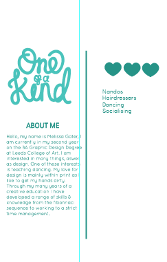
So therefore I have spread the title and made it bigger as this is just a jokey quote in which I then go further into detail about me and why I love design and also my love for teaching dancing. I think that this is equally balanced as although the title is just off set it it very heavy and therefore its not fully on the first column and therefore the heavy stroke is heavier than the bodycopy.
Then I decided to then go on to the boring details of where I have attended within education and where my skills lie, I am going to place both of this information on one page so its all done within one page.
I haven't graded my skills on adobe I have just out the suites that I have knowledge on. This way they can ask me how I feel about the suite and then I can tell them how happy I would be to work on my own. I then wanted to balance it out so also put a vector on the education side too.
This is the back of the pack, I am very happy with this as then you will not be able to see the block colour coming through on either side. I have added the thank you as this is the last place they will look hopefully. This is within the same style of the other side and interpretation within the pattern of the waves.
This is the front & back finals. So I have set it up to print this will be printed back to back. I am very happy with this overall and I am glad I decided to use my CV as my promo packaging as this is making a purpose of this and not just doing it for the making sake.


No comments:
Post a Comment