Part 1: Logo Development
This is my sheet that I have done some designs for my logo. I wanted to have a typeface lettering as this represents my practice. The middle one is signature, This then I thought about interpreting into my logo. The loops I feel are going to be too confusing calling myself Melissa Gater and then having this that doesn't look like my name at all. I then started to play with the M and different ways I could draw it. My favourite is the middle top one but I don't think I would have el to make it into Mel.
So now I have started to computerise this....
So this is the basic outline, I am very pleased with this I like it is unusual & you can tell it is bespoke. Therefore representing my practice.
I now want to add more dimension to give a calligraphy feel. I like the fill does as something to the M and therefore I am going to follow this onto the next stroke of the leg of the M.
Now I think that this now needs to go to another extreme and make the ends go to a point, so that all dimensions are smooth & flowing.
This is my final design, I have refined it by touching up with the manipulation tool on illustrator. I now am going to try adding other elements on the M.
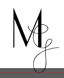
Now i have tried to link it up from the end. Although, I think that this looks childish and doesn't add anything to the M, as I think it might work well on its on. Then I tried the added touch of the calligraphy effect in the stroke so that it showed me the effect it would look if I enhanced it myself.
I decided to try other ways to brand myself after just to make sure that I have tried all avenues. I think the G is too thin and doesn't add any element to the M. I do like the block capital of the M on the right and the contrast of the thin script of the G. Although, I don't think this reflects me as a designer.
I have decided with this overall, I think this is clean and simple and can be portrayed in many different ways. I have designed this purely in black and this moment due to the cost of printing and then I thought I could add colours when thinking about my branding.


No comments:
Post a Comment